With 25+ restaurants entirely in Tucson, Arizona, eegee’s was a big success in a small pond. To win in larger, more competitive cities, the brand needed a significant overhaul—without losing what makes it special.
Brand Repositioning Strategy
In order to grow, eegee’s needed to capture a new audience without alienating their core. I led a discovery process using multiple overlapping data sources to garner audience insights. In the end, we had a repositioning strategy that was tactically sound while also providing the attitude and behavior details that would ultimately drive creative development.
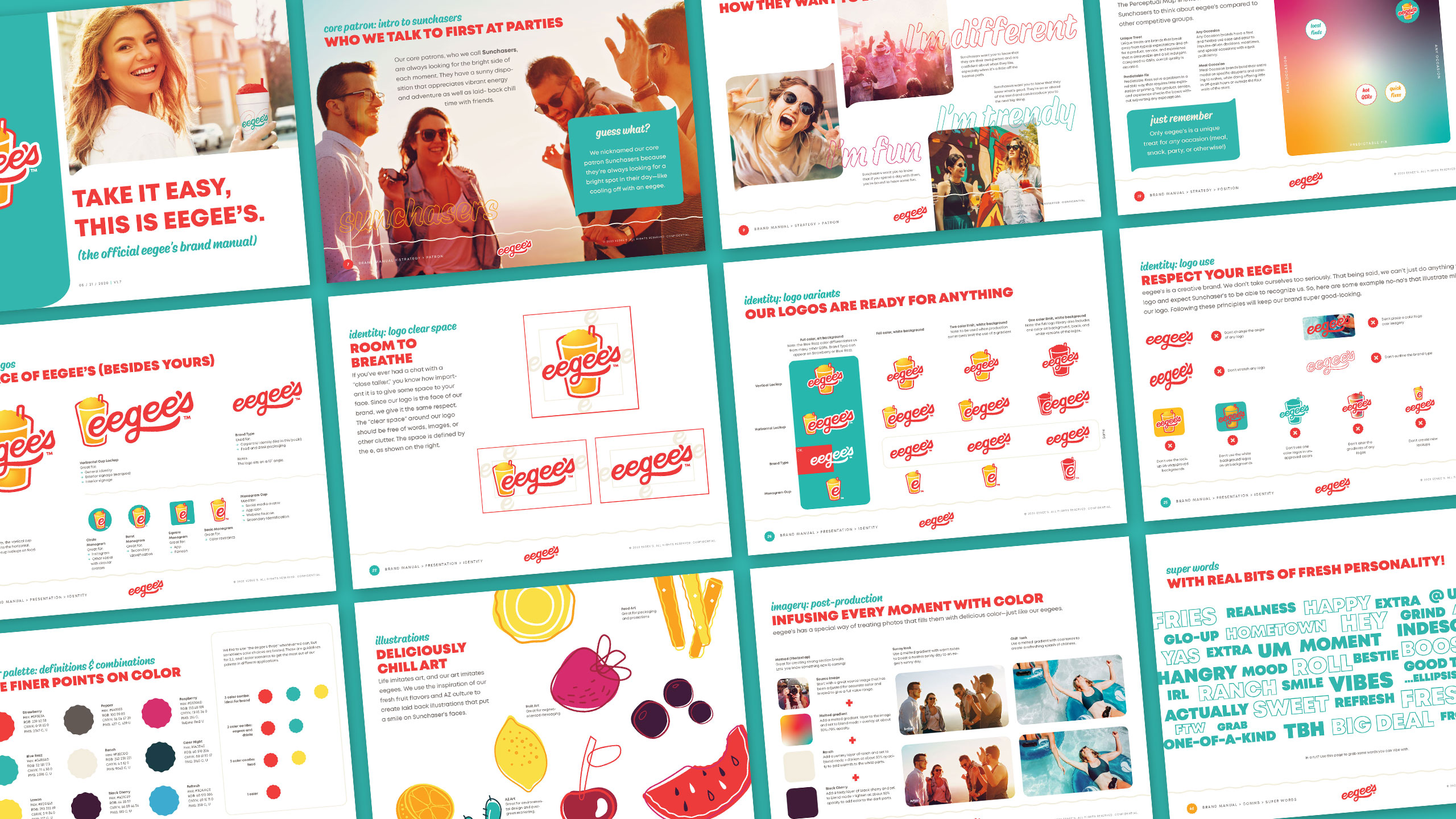
Brand Identity Design & Testing
With a strategy in place, we developed several options for both visual identity and messaging elements. I led the design, fielding, and analysis of in-market surveys which indicated clear winners in each category tested. Preference over the current branding was clear for both growth and current core audiences, giving the client the confidence to fully embrace the rebrand.
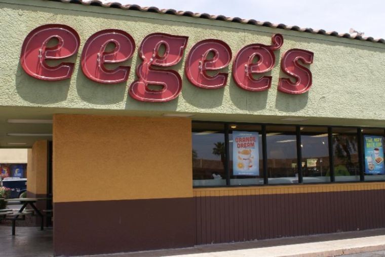
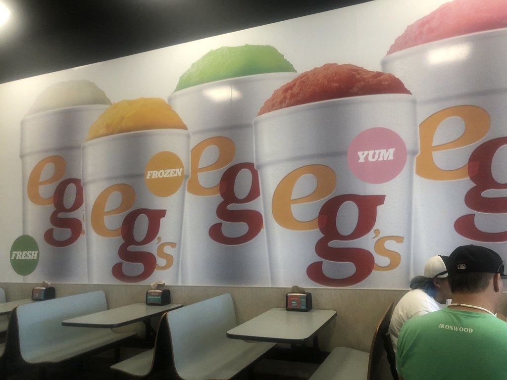
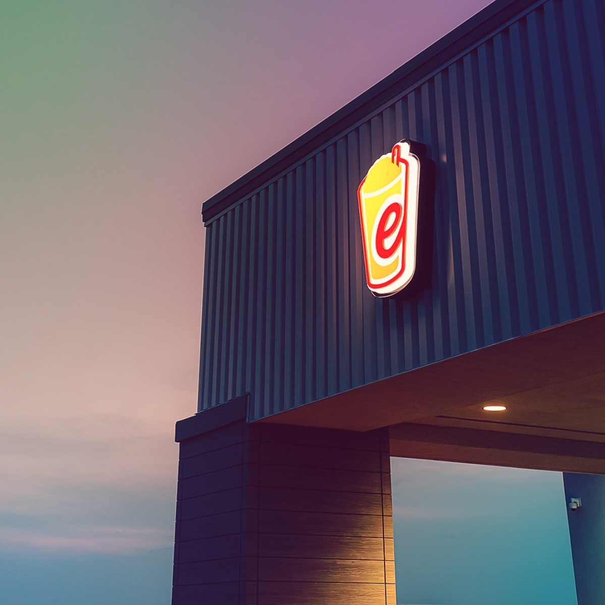
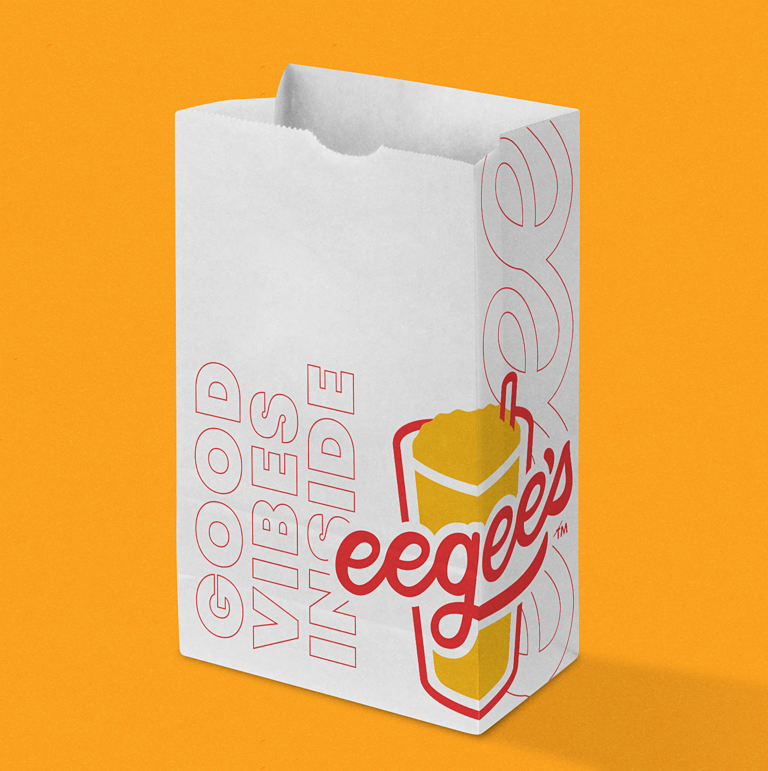
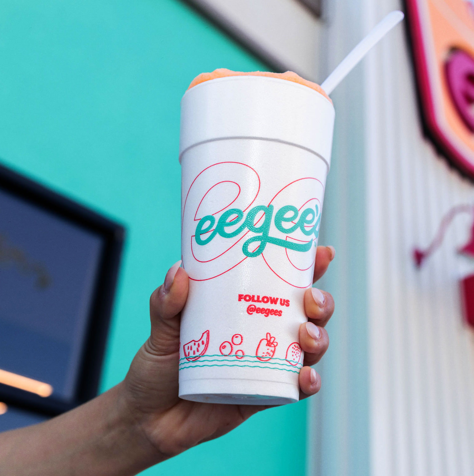
The new visual and verbal identity systems combined elements from eegee’s 1971 and 2008 brands, while infusing the brand with a burst of fresh energy designed to connect with their new audience. The robust visual identity system included extensive visual assets and detailed usage rules which successfully guided a complete overhaul of every brand touchpoint, both physical and digital.
Tagline & Verbal Identity
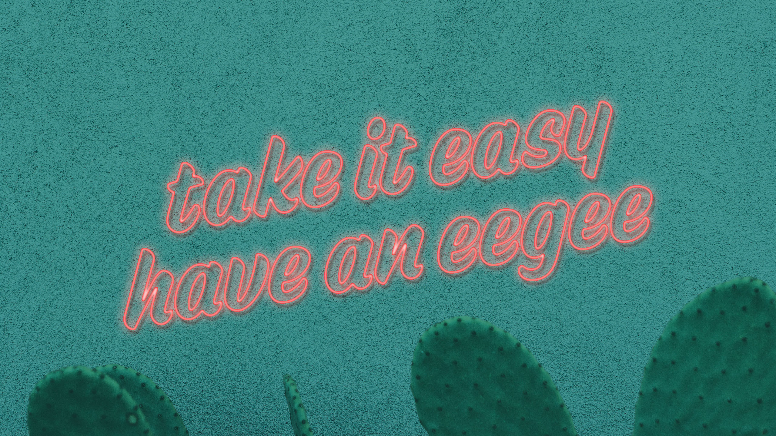
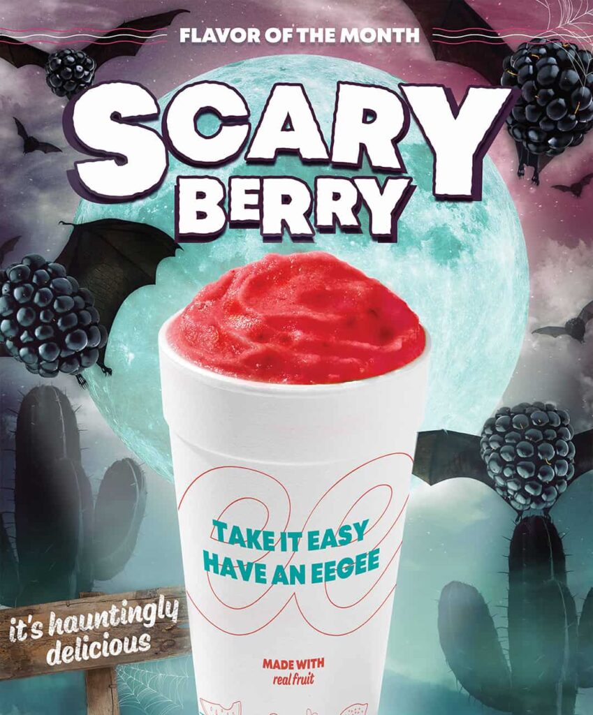
At the center of the verbal identity system was a new tagline: take it easy, have an eegee. What on its surface is simply a personality play actually was written to solve two tactical issues: 1) the tagline explains that eegee’s is a place where you can buy a product called an eegee and 2) the rhyme clues new audiences into how to pronounce the brand name, which was often mispronounced “EGG ies.”
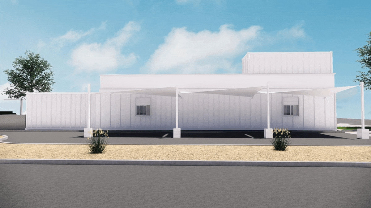
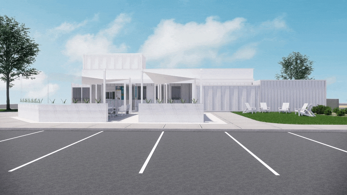
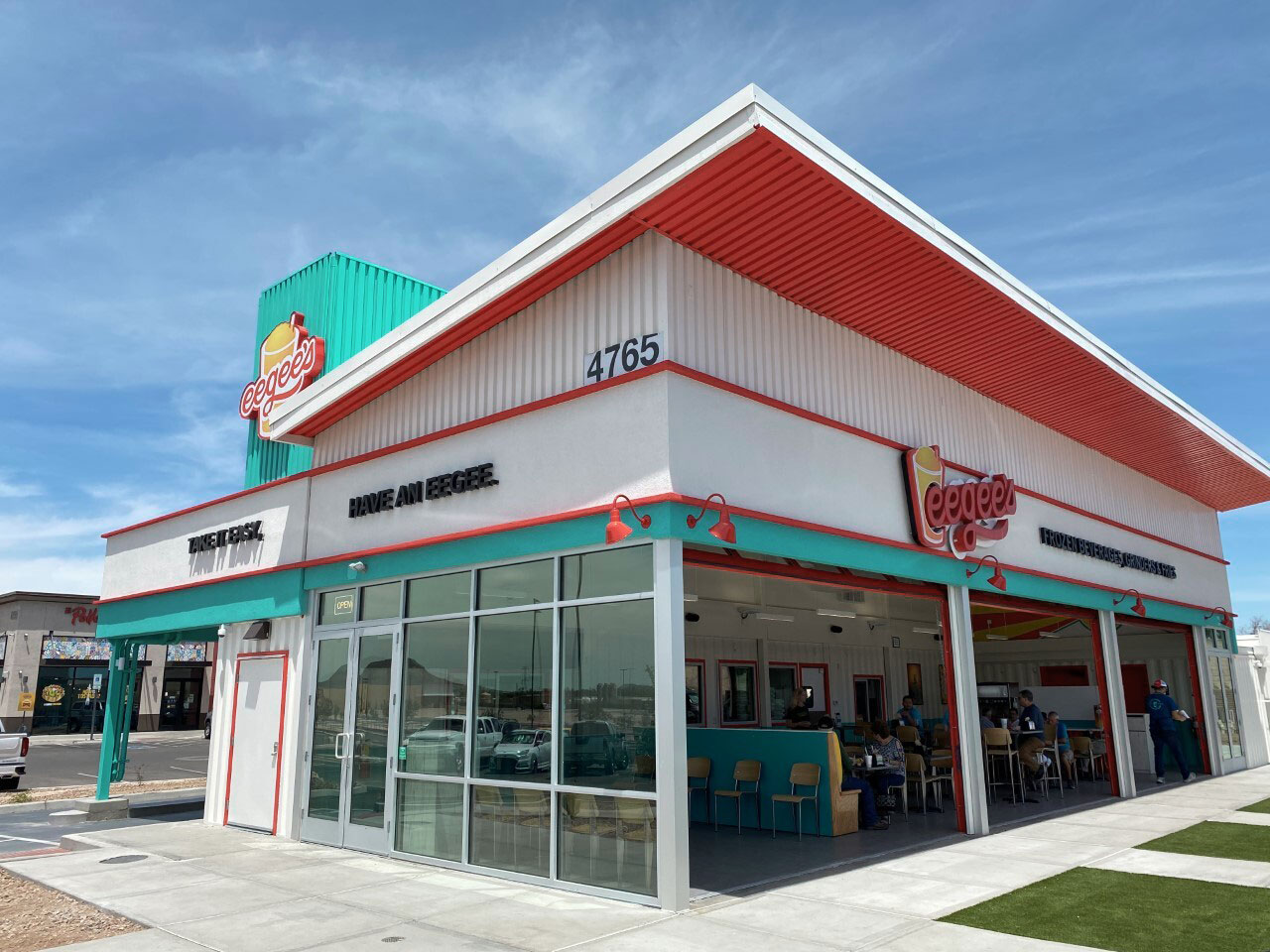
Restaurant Design & Focus Group
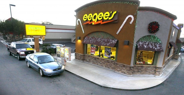
In collaboration with the client’s architect, we developed exterior and interior design support. This process happened in parallel to the finalization of the brand identity. I participated in an in-market focus group to learn how locals would respond to the visual change to the brand. The result is a look that combines heritage queues with a modern, energetic design sensibility. This work was carried over to all new location launches.
Photography Art Direction & Brand Touchpoints
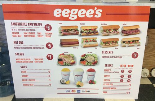
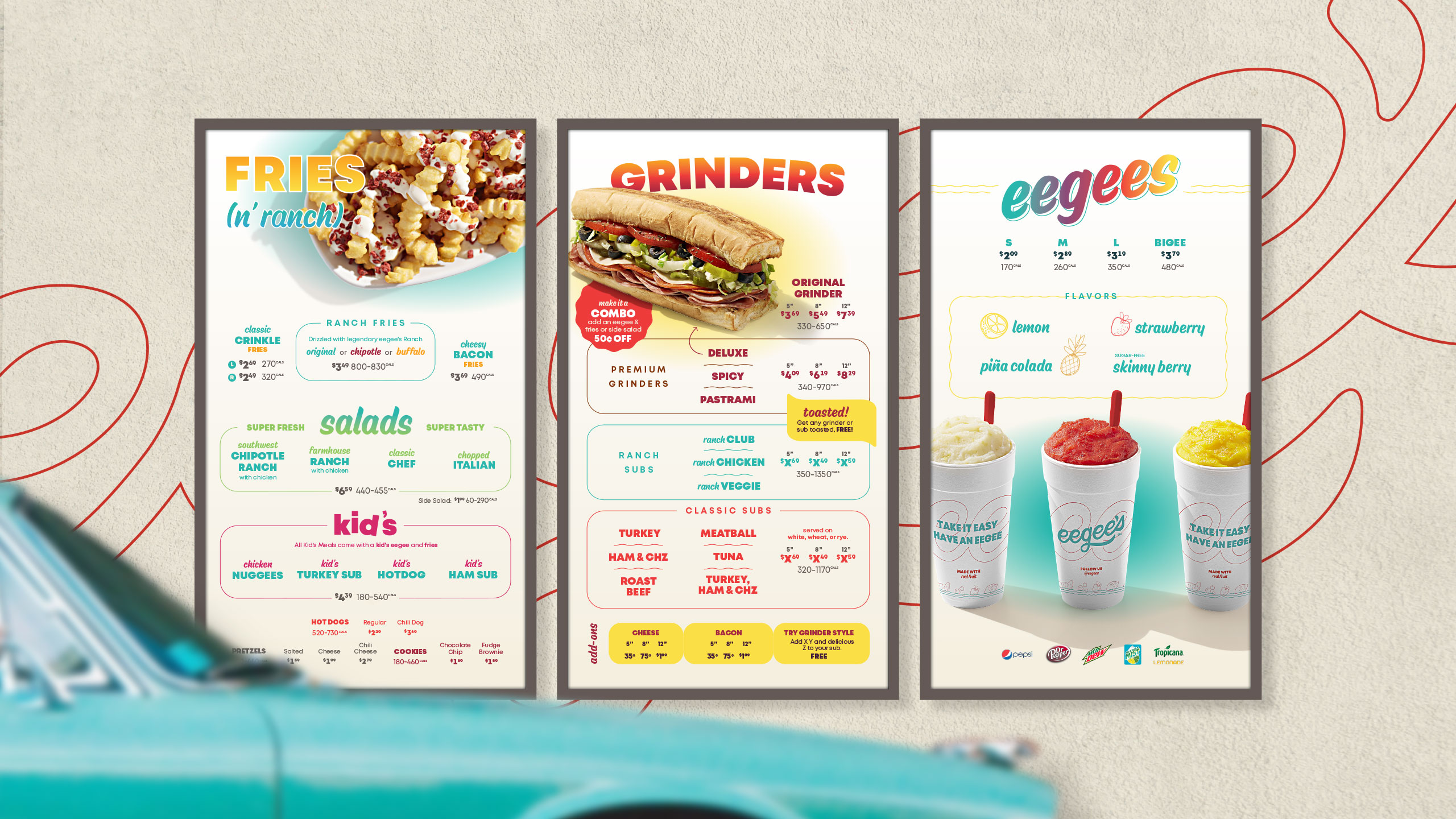
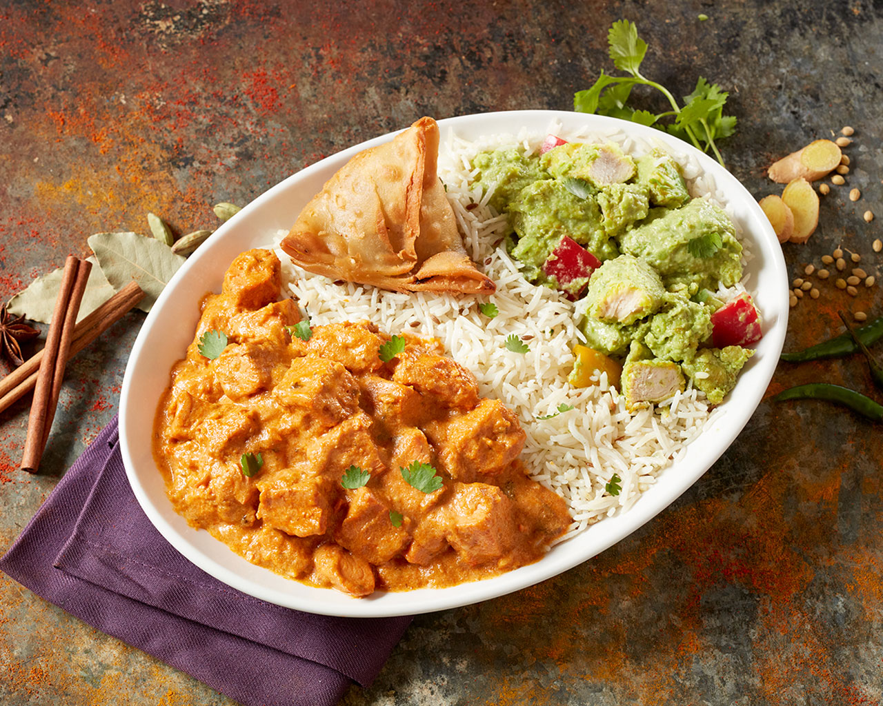
Often photography is not included in branding, but for most brands this is a missed opportunity. I provided art direction on a food shoot with the goals of bringing the branded photos in line with our new strategy and increasing appetite appeal. These assets served as a cornerstone for both menu and marketing materials.
Menu Engineering & Design
Menu engineering is the practice of using item sales data to simplify and re-structure a menu with the goals of boosting ticket averages and service speed. I helped guide this process before leading menu UX and design. The resulting update had an immediate, significant impact on sales wherever it was rolled out.
Marketing Creative
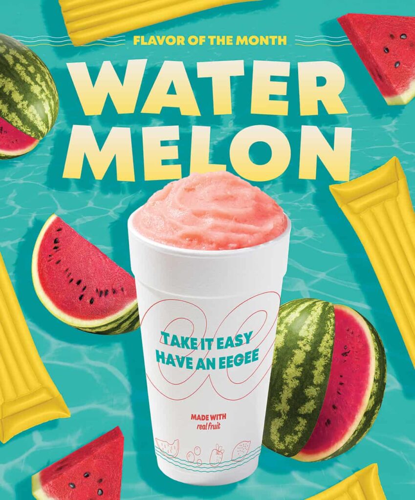
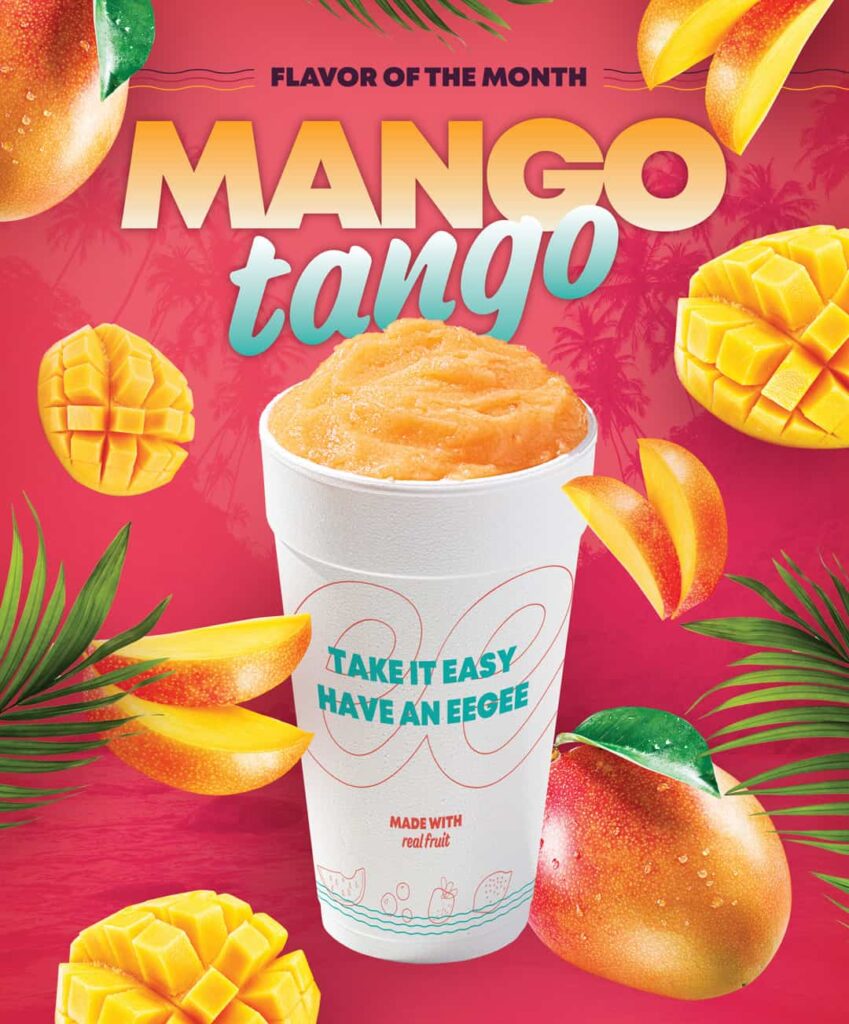
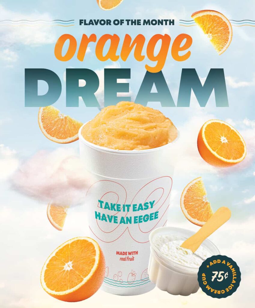
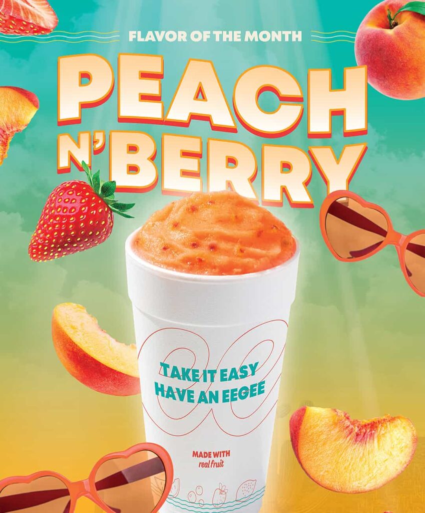
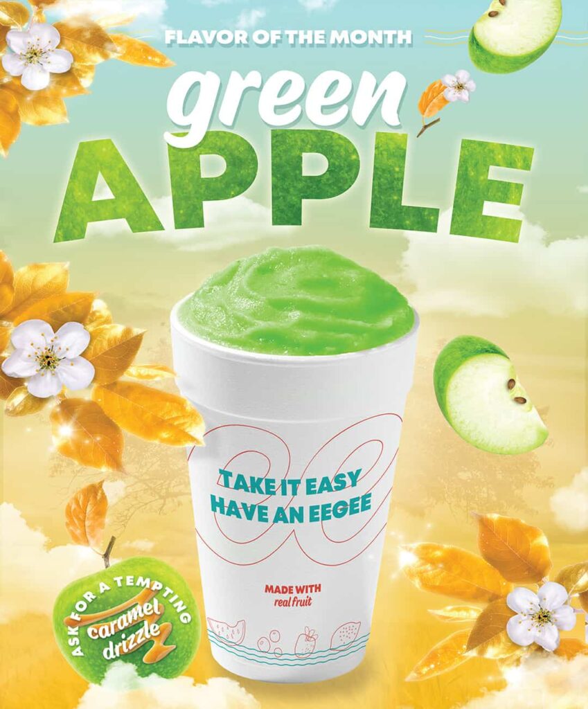
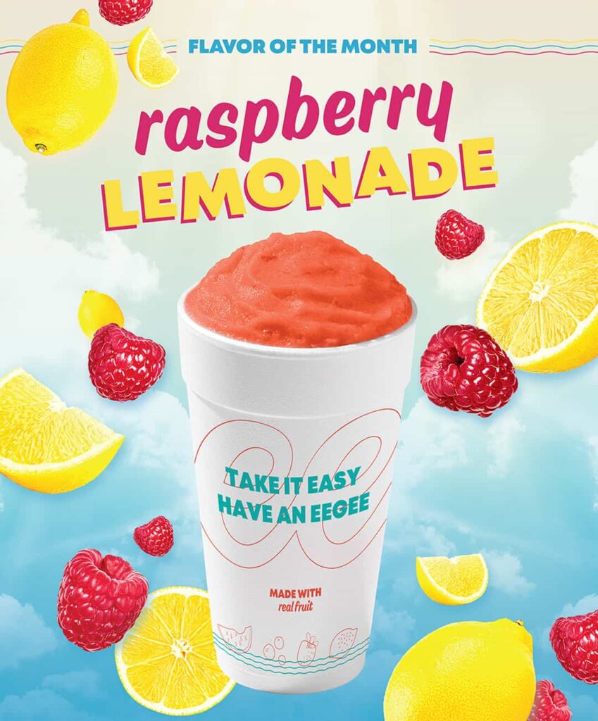
After a successful rebrand, eegee’s made Vigor their agency of record. I provided creative direction for countless pieces of marketing creative, including a series of “flavor of the month” posters.
When we started the eegee’s rebrand, they didn’t have any locations in Phoenix—and a past attempt to enter that market had failed. At the time of writing, eegee’s has 5 restaurants in Phoenix.
Credits
Client: eegee’s Agency: Vigor Strategist, Creative Director: Aaron Tovi Designers: Natalie Suarez, Maria Tamayo, Chia-Yu Hsu Copywriter: Laura Relyea Photographer: Matt Brown, Fratelli Studio Architect: Fitch
Related projects
Introducing Indian Fast-casual to the West
Sankranti Indian Kitchen Branding
Forging Two Fundraising Brands Into a Powerhouse
Alloy Fundraising Branding
Launching an Innovative Brand for a Century-old Nonprofit