Mondelez International, Sun-Maid, Starkist, Litehouse Foods
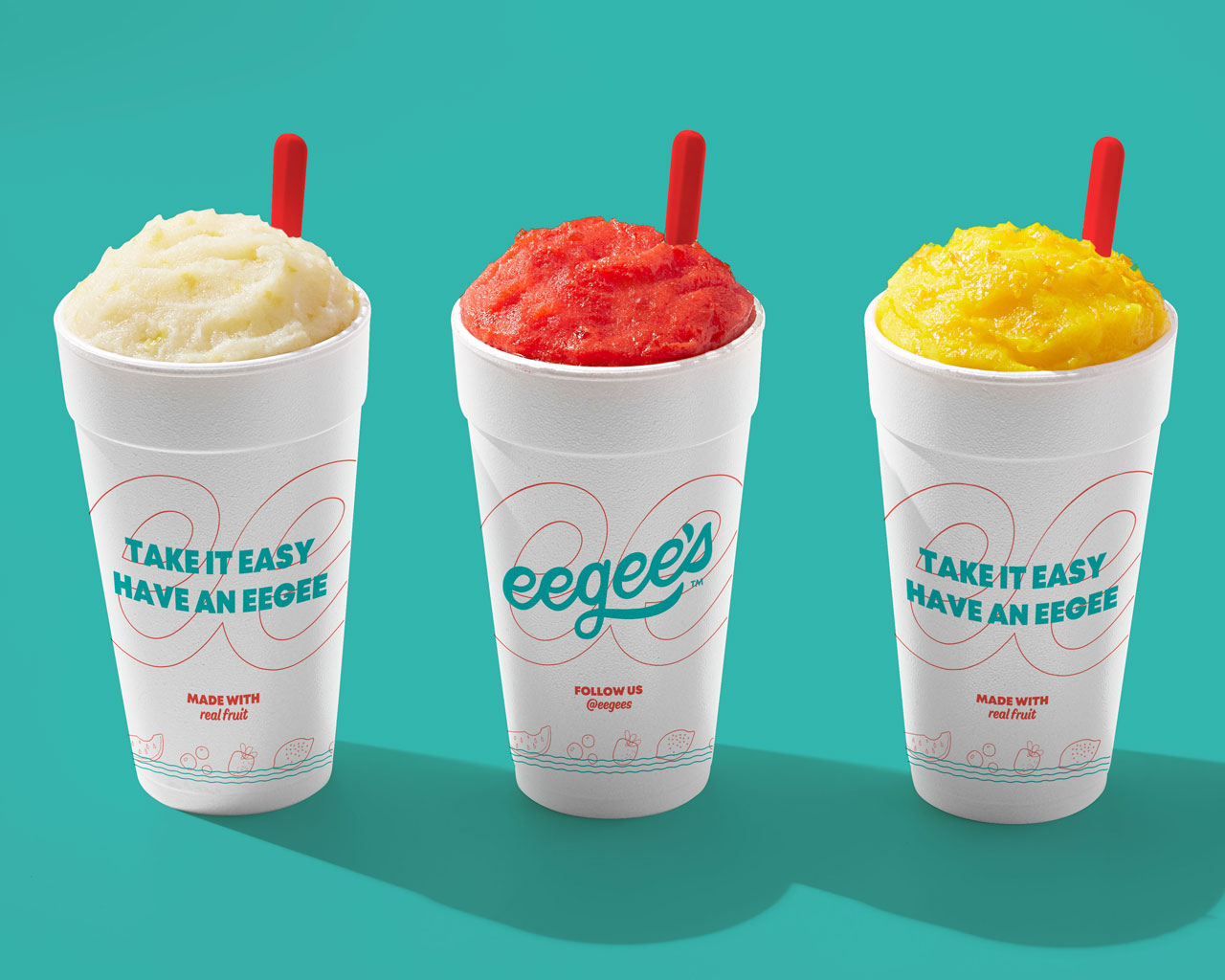
Elior North America, Sodexo, InterContinental, IHG, Mariott, eegee’s, GrubHub, Erik’s Delicafe, Over Easy
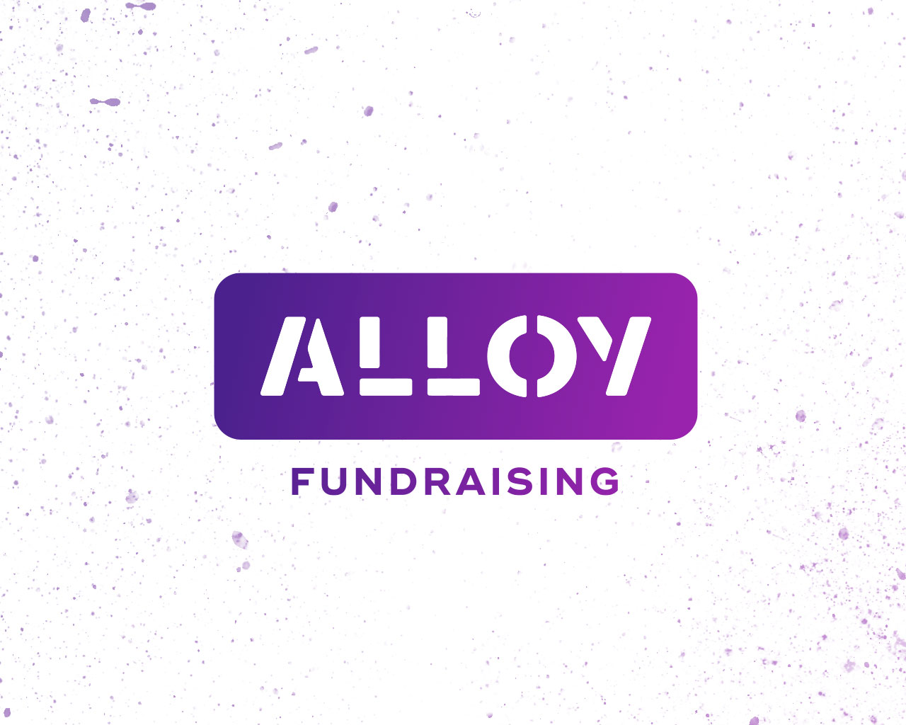
Junior Achievement, Verizon, Region’s Bank, Alloy Fundraising